React has undergone substantial upgrades since its introduction in 2013, becoming an invaluable tool for React developers. But as applications grow more complex, maintaining best practices and design patterns becomes critical to ensuring maintainability, efficiency, and scalability. That’s why we offer you all of the latest React component design patterns for 2023.
This blog post will delve into essential React topics such as functional components, hooks, component composition, and state management. We aim to equip you with practical knowledge to apply to your projects immediately. Whether you are an experienced React developer or a newcomer, this guide can help you create more efficient and maintainable components.
As a React developer, your success hinges on keeping up with the latest design patterns. That’s why we are thrilled to share these best practices with you, so you can create high-quality applications that meet users’ needs. So let’s dive right in!
Why Choose React JS for Enterprise App Development for Your Next Project?
What are React Design Patterns?
React design patterns provide efficient solutions to React development issues, saving developers time and effort with proven solutions. They simplify complex applications while relieving stress on development teams by allowing individual components to share logic without duplicating effort.
Benefits of React Component Design Patterns

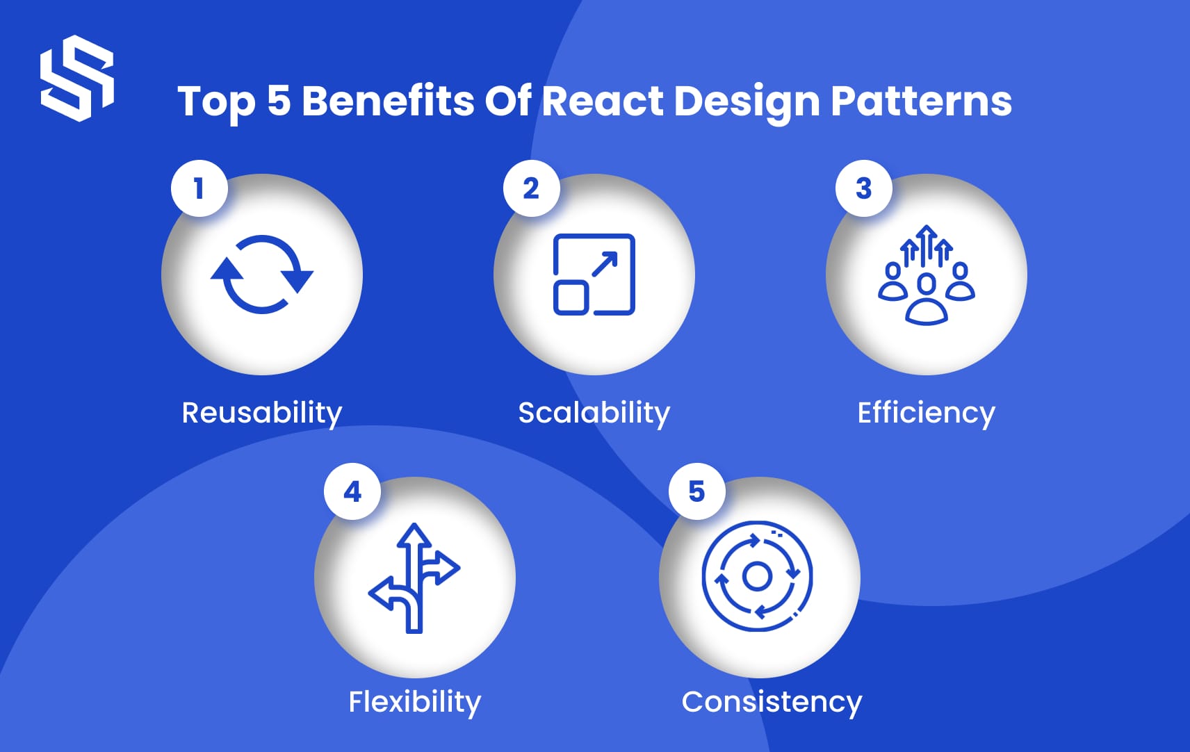
React component design patterns offer numerous advantages that significantly enhance your development process. These patterns accelerate the pace of React development and optimize the codebase for improved maintainability and readability. By leveraging these patterns, you can ensure your React applications are scalable, reusable, and modular.
Some of the key benefits of using React component design patterns include the following:
1. Reusability
You may construct reusable components using React component design patterns, which can then be utilized in various locations across your application. This saves time and effort during development while assisting in creating a unified and consistent user interface.
2. Scalability
Your React application may expand effortlessly as it develops with the help of component design principles without becoming unduly complicated or challenging to maintain. This is so that modifications made to one component won’t impact other components since each component is independent.
3. Efficiency
React’s component-based design and virtual DOM enable speedy updates and rendering, improving efficiency and reducing the time it takes for pages to load. As a result, your application will operate more quickly and effectively for the user.
4. Flexibility
With component design patterns, you can mix and match various components to build unique solutions tailored to your requirements. This allows you to design distinctive user interfaces suited to your application’s needs, providing you with a competitive advantage in the market.
5. Consistency
By adhering to accepted design patterns, the user experience of your application will be more uniform, making it simpler for users to browse and comprehend. This might improve user happiness and engagement, eventually increasing traffic to your application and generating more revenue.
Ready to take your React development to the next level?
Hire dedicated React JS developers from Syndell to build scalable, feature-rich applications that meet your business needs.
Top 9 React Design Patterns in 2023

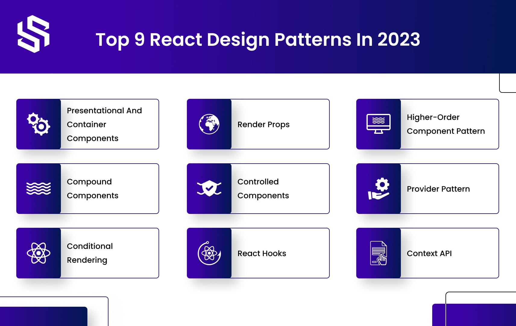
React design patterns offer developers proven and efficient solutions to common problems in building web applications. Below are the top 9 React design patterns to consider:
1. Presentational and Container Components
This pattern separates a component’s display and data logic.
A presentational component only handles the presentation of data, while a container component handles data logic and passes the data down to the presentational component. This separation of concerns makes it easier to maintain and reuse components.
Here’s an example of the code structure for presentational and container Components:
// Presentational Component const Button = ({ onClick, children }) => { return ( <button onClick={onClick}> {children} </button> ); }
// Container Component class ButtonContainer extends React.Component { handleClick = () => { // handle click logic } render() { return ( <Button onClick={this.handleClick}> Click me! </Button> ); } }
In this example, the button component is the presentational component that only handles the button’s display. The button container component is the container component that handles the click event’s logic and passes it down to the button component as a prop.
Using the presentational and container component patterns helps to separate concerns and make your code more organized and easier to maintain in the long run.
2. Compound Components
Compound components are a React design pattern that allows you to compose multiple components together to create a more complex UI element. In this pattern, one component serves as the container, or parent component, while the others serve as child components that render inside the parent component.
Here is an example of how to implement the compound component pattern in React:
import React from “react”; const ParentComponent = ({ children }) => { return <div>{children}</div>; }; const ChildComponent1 = () => { return <p>This is child component 1</p>; }; const ChildComponent2 = () => { return <p>This is child component 2</p>; }; const CompoundComponent = { Parent: ParentComponent, Child1: ChildComponent1, Child2: ChildComponent2 }; export default CompoundComponent;
In this example, there are three components: ParentComponent, ChildComponent1, and ChildComponent2. The ParentComponent acts as a container component, rendering the child components inside it through the ‘children’ attribute. ChildComponent1 and ChildComponent2 are the child components that render inside the parent component.
The parent and child components are used to export the composite component using an object. This makes it simple for other developers to include the compound component in their programs.
An illustration of using the CompoundComponent in another component is shown here:
import React from “react”; import CompoundComponent from “./CompoundComponent”; const App = () => { return ( <CompoundComponent.Parent> <CompoundComponent.Child1 /> <CompoundComponent.Child2 /> </CompoundComponent.Parent> ); }; export default App;
In this example, we import the CompoundComponent and use its parent and child components to build a complicated UI element. We render the child components within the parent component by employing the child component tags as children of the parent component.
3. Conditional Rendering
React’s conditional rendering design pattern enables you to render various components or elements depending on specific circumstances. This is helpful when you want to show various information based on user interactions, state changes, or different scenarios.
Here is an illustration of conditional rendering in React:
import React, { useState } from “react”; const App = () => { const [isLoggedIn, setIsLoggedIn] = useState(false); const handleLogin = () => { setIsLoggedIn(true); }; const handleLogout = () => { setIsLoggedIn(false); }; return ( <div> {isLoggedIn ? ( <button onClick={handleLogout}>Logout</button> ) : ( <button onClick={handleLogin}>Login</button> )} </div> ); }; export default App;
In this example, we have an App component with a state variable named ‘isLoggedIn’ that is initially set to false. We also have two methods to change the ‘isLoggedIn’ state variable: ‘handleLogin’ and ‘handleLogout.’
In the component’s return statement, the ternary operator determines if the user is logged in or not. If the user is logged in, it will display a button with the words ‘Logout’ and the ‘handleLogout’ function as its onClick handler. If the user is not logged in, it will display a button with the words ‘Login’ and the ‘handleLogin’ function as its onClick handler.
Depending on the current value of the ‘isLoggedIn’ state variable, the UI will display either a ‘Login’ or a ‘Logout’ button.
Conditional rendering is a powerful React tool that lets you construct dynamic UIs that adapt to user interactions and state changes. This pattern may be used to reveal or conceal items, modify their content, or even render totally distinct components based on the conditions you define.
Node.js vs React.js: Which to Choose for Your Web Application
4. Render Props
Render props is a React design pattern that lets you exchange code between components by giving a function to a child component as a prop. This method returns JSX to utilize the child component in rendering its UI.
Here is an illustration of how to use render props in React:
import React from “react”; const RenderPropsComponent = ({ render }) => { const data = “Hello, World!”; return <div>{render(data)}</div>; }; const App = () => { return ( <RenderPropsComponent render={(data) => { return <p>{data}</p>; }} /> ); }; export default App;
In this example, we have a component named RenderPropsComponent that takes a prop called ‘render.’ This prop is a function that takes a data argument and returns JSX. Within the component, we call the ‘render’ function and supply some data as an argument. The ‘render’ method produces JSX, which is rendered inside a div element.
In the App component, we utilize the RenderPropsComponent and pass in a ‘render’ parameter that describes how the data should be presented. In this scenario, we return a paragraph element with the data as its text content.
By providing alternative render functions as props, we can reuse the RenderPropsComponent in different parts of the application and modify how the data is rendered.
5. Controlled Components
Controlled components are a React design pattern that lets you control the status of a form input element by storing its value in the component’s state and updating it using the onChange event handler. This enables you to access and edit the value of the input in the component’s state, as well as enforce rules on the input.
Here’s an example of how to implement controlled components in React
import React, { useState } from “react”; const ControlledComponent = () => { const [inputValue, setInputValue] = useState(“”); const handleChange = (event) => { setInputValue(event.target.value); }; const handleSubmit = (event) => { event.preventDefault(); alert(`You submitted: ${inputValue}`); }; return ( <form onSubmit={handleSubmit}> <label> Name: <input type=”text” value={inputValue} onChange={handleChange} /> </label> <button type=”submit”>Submit</button> </form> ); }; export default ControlledComponent;
The ControlledComponent component in this illustration has a state variable named “inputValue” that was initially set to an empty string. ‘handleChange’ and ‘handleSubmit’ are two more functions that manage the onChange and onSubmit events, respectively.
We create an input element and a form element with a label in the component’s return statement. The value attribute of the input element is assigned to the “inputValue” state variable, and the onChange event handler for the input element runs the “handleChange” function. The ‘handleChange’ function inserts the new value into the ‘inputValue’ state variable when the user inputs into the input field.
The ‘handleSubmit’ function is called, and an alert message is shown with the value of the ‘inputValue’ state variable when the user submits the form. This allows us to regulate the behavior of the form input element and enforce rules on it, such as a character limit or input validation. React’s powerful tool of controlled components makes it simple to build dynamic and interactive forms.
6. React Hooks
React Hooks is a collection of methods introduced in React 16.8 that allow you to leverage state and other React capabilities without having to write a class component. React hooks include useEffect, useContext, and useReducer, which enable more complicated use cases.
Here’s an example of how React Hooks may be used in a functional component:
import React, { useState } from “react”; const HooksComponent = () => { const [count, setCount] = useState(0); const handleClick = () => { setCount(count + 1); }; return ( <div> <p>You clicked {count} times</p> <button onClick={handleClick}>Click me</button> </div> ); }; export default HooksComponent;
In this example, a HooksComponent component uses the useState hook to monitor a count state variable. We use the useState hook to set the initial value of the count state variable to 0 and assign it to the ‘count’ variable. In order to update the count state variable, we also utilize the useState hook to create a ‘setCount’ function.
We built a function called ‘handleClick’ that calls the ‘setCount’ function with the new value of the count state variable to update the count state variable.
We produce a paragraph element that shows the current value of the count state variable and a button element that, when pressed, triggers the ‘handleClick’ function in the component’s return statement.
Do you have a unique app idea, but don’t know where to start? Let Syndell help you turn your vision into reality.
7. Higher-Order Component Pattern
The Higher-Order Component (HOC) pattern is a React design pattern that allows you to reuse component code by wrapping a component with a function that improves its capabilities. Here’s an example of how to use the HOC pattern in React:
import React from “react”; const withLogger = (WrappedComponent) => { class WithLogger extends React.Component { componentDidMount() { console.log(`Component ${WrappedComponent.name} mounted`); } componentWillUnmount() { console.log(`Component ${WrappedComponent.name} unmounted`); } render() { return <WrappedComponent {…this.props} />; } } return WithLogger; }; const MyComponent = () => { return <div>My component</div>; }; const LoggedComponent = withLogger(MyComponent); export default LoggedComponent;
In this example, we have a function named ‘withLogger’ that accepts a component as input and produces a new component that encapsulates the original component. When the new component mounts and unmounts, it sends notifications to the console.
We define the ‘MyComponent’ functional component, which only renders a div element.
The MyComponent is wrapped using the withLogger function, and it is then assigned to a new variable named LoggedComponent. The improved component with the logging capabilities is now stored in the LoggedComponent variable.
The original component is now rendered with the additional logging capability when we utilize the LoggedComponent in our application. The statements reported to the console when the component mounts and unmounts would be visible if we render the LoggedComponent component in another component.
8. Provider Pattern
React’s Provider design pattern makes it possible to share data across components without having to send it via each and every intermediary component.
Here is an illustration of how the Provider pattern may be used in React:
import React, { createContext, useState } from “react”; const MyContext = createContext(); const MyProvider = ({ children }) => { const [count, setCount] = useState(0); const incrementCount = () => { setCount(count + 1); }; const decrementCount = () => { setCount(count – 1); }; return ( <MyContext.Provider value={{ count, incrementCount, decrementCount }}> {children} </MyContext.Provider> ); }; const MyComponent = () => { const { count, incrementCount, decrementCount } = useContext(MyContext); return ( <div> <p>Count: {count}</p> <button onClick={incrementCount}>Increment</button> <button onClick={decrementCount}>Decrement</button> </div> ); }; export default () => ( <MyProvider> <MyComponent /> </MyProvider> );
In this illustration, the component MyProvider creates a context object using the createContext Hook to store the data and actions that we wish to share with other components. A state variable called “count” and two functions to increase and decrease it is also defined in the MyProvider component.
When a child component needs access to a shared state or action, we wrap it in the MyContext.Provider component. As the value prop, we supply the MyContext.Provider component with an object that contains the state and actions.
To access the shared data and actions from the MyContext object, we construct a functional component named MyComponent that employs the useContext Hook. MyComponent generates two buttons that call the incrementCount and decrementCount functions to update the count state variable, along with a paragraph element that shows the current value of the count state variable.
We export the MyProvider component that is encapsulated in the MyComponent component so that any MyProvider component’s child component may access the shared state and actions.
9. Context API
React has a feature called the Context API that makes it possible to share data across components without having to go through all the intermediary components.
Here is an illustration of how to utilize React’s context API:
import React, { createContext, useState } from “react”; const MyContext = createContext(); const MyComponent = () => { const { count, incrementCount, decrementCount } = useContext(MyContext); return ( <div> <p>Count: {count}</p> <button onClick={incrementCount}>Increment</button> <button onClick={decrementCount}>Decrement</button> </div> ); }; const App = () => { const [count, setCount] = useState(0); const incrementCount = () => { setCount(count + 1); }; const decrementCount = () => { setCount(count – 1); }; return ( <MyContext.Provider value={{ count, incrementCount, decrementCount }}> <MyComponent /> </MyContext.Provider> ); }; export default App;
In this illustration, the useContext hook is used by a component called MyComponent to gain access to the shared information and actions of the MyContext object. MyComponent generates two buttons that call the incrementCount and decrementCount functions to update the count state variable, along with a paragraph element that shows the current value of the count state variable.
The createContext hook is utilized to create a context object named MyContext. This context object contains the state and operations that we wish to share with other components.
We construct a functional component called App that defines two functions to increase and decrease the count state variable as well as a state variable named “count.”
The child components that need access to the common data and actions are encapsulated in MyContext.Provider component. We supply the MyContext.Provider component with an object that contains the state and actions as the value prop.
We export the App component that encloses the MyComponent component so that MyComponent may use the useContext hook to access the shared information and actions.
Angular vs React 2022: It’s Time to Decide!
Conclusion
In conclusion, React design patterns are essential tools for any React developer in 2023. These patterns offer a structured approach to building complex and scalable applications with React, providing efficient solutions to common development problems. By leveraging React component design patterns, developers can create reusable, maintainable, and flexible components that can be used across multiple applications. This, in turn, leads to faster development, fewer errors, and improved user experiences.
Businesses looking to leverage React JS development services should focus on hiring skilled developers familiar with React design patterns. Syndell stands out as a top React JS development company by providing experienced React developers who specialize in creating scalable, maintainable web applications using React design patterns tailored specifically for business-specific needs. Contact us now to discover how we can meet all your React JS development requirements!


