Design Trend: Soft UI
There’s one app and website design trend that’s subtle and almost the ‘smoothest’ thing for your eyes.
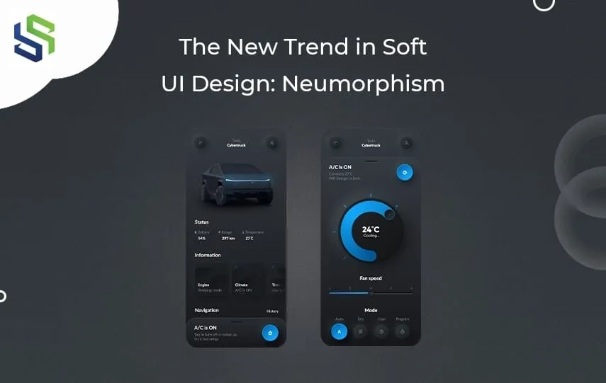
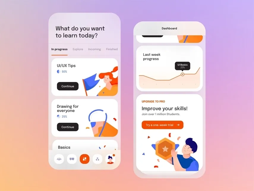
The soft UI design creates a frosty-style blur or a glassy blur. The elements on the screen sink in, blend, and yet extrude from the background to create a certain level of depth in the dimensions. Combine this effect with a softer, pastel palette to bring that ‘softness’ to the interface. Add depth with subtle shadow effects. If you cannot recall what we mean, look at this example.
Source : Dribbble – Art by Lee
This design trend is a shift from all things bold and flat. Soft UI design, also known as neumorphism. It is quite the opposite of the bold themes because it’s less dramatic and has muted colors, contrasting shadows, and lighter typography for smoother design results.
To better understand this design, we need to travel back to the first design from which neumorphism was adopted. Let’s take this learning process step by step.
The Shift To Neumorphism
Since the 1980s, web developers, desktop app developers, UI/UX designers, and mobile developers have constantly been working to improve the user experience for both the users and the customers. These design trends since then have played a significant role in revitalizing digital experiences.
The shift started from a family tree where Skeuomorphism is the mother of all trends and flat designs are the father. They spawned a new type of catchy UX, called the soft UI, neumorphism, or ‘New Skeuomorphism’.
At this point, you might be all thought about what is the difference between the three. Let’s resolve your confusion.
Skeuomorphism
Skeuomorphism design trends define an interface that takes inspiration from or simply mimics the real world. For example, think of the recycle bin icon on your desktop. The bin icon truly represents a dustbin, which is a real-life object. Well, all of us are probably familiar with it. Taking this as a concept, Skeuomorphism was meant to make early computer interfaces more intuitive and familiar to use.
Smartphones then evolved, making real-life buttons look cluttered. This is why flat designs came into existence.
Flat Design
Flat designs were inspired by minimalism. Moving away from 3D, these designs are free from gradients, textures, and shadows. Instead, it focuses on amplifying User Experience (UX) with the help of solid flat colours and elements. Flat designs are the easiest to implement. They can be made responsive too for different screen sizes.
You may find them a bit limiting at times as the designs appear less intuitive and too minimal. And so, material design was introduced, which can be said to be a subtler version of Skeuomorphism.
Read More About: Web Design Trends That Actually Matter in 2026
What is Neumorphism?
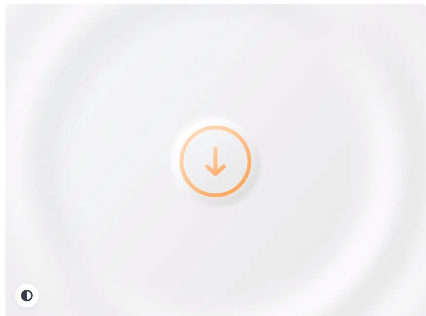
Neumorphism, or soft UI, is a combination of Skeuomorphism and flat design. The visual style combines background shapes, colours, highlights, gradients, and shadows that give dimension to your graphics, switches, and buttons. Here is an example to clarify what we actually mean:
Source : Dribbble – Art by Andrew Mamontov (video)
Look carefully and tell if you can feel that the elements seem like they are being pushed through the display. Yes, that’s precisely what Neumorphism does.
What should you expect from software UI design? Well, here are some of its key characteristics that’ll help you understand the design better.
- The monotone colour palette is soft.
- Fuzzy shadows separate the elements or the items.
- Smooth edges and round corners.
- The unified icon is set to match the colour and softness.
- Edge is taken out of the background with the help of gaussian blur.
- Lighter typography.
- High-resolution design elements.
- Use of subtle variations of fade, gradients, and other simple colour patterns.
- Realistic feeling.
Apart from its common elements, Neumorphism designs give us some compelling explanations affirming why it still stands out today.
Why Neumorphism Still Stands Out Today
It symbolizes realism
Neumorphism basically symbolizes real-life items and elements that behave in a physics-based manner. For instance, designing a button should look like a button because we want users to experience an interface with similar materials used in the physical world. The elasticity of Neumorphism allows its designers to explore and experiment with new interface materials. Simply put, this soft UI design should always sound new, look sharp, and reflect a realistic perspective on designs.
Colours have a primary role
Colours have the capacity to give a protruding appearance to your website, app, or design. Even users want to see some colours that are new and fresh. As you can tell from looking at the examples above, the Neumorphism UI style is defined by the use of contrasts and strong colours.
Shadowing colours can be used incredibly to make the elements look like they are popping out from the screen, giving it a whole new look. Also, these shadows make the elements sink into the background.
It increases the usability
Neumorphism comes with easy access and enhanced design usability. This software UI gives users the opportunity to innovate existing possibilities and bring considerable differences to the design trend. This is one of the reasons why Neumorphism is efficient, performs well, and offers the utmost satisfaction.
You can count it as a groundbreaking design pattern made to define the future of product design.
Is it still beneficial to use?
Debates have clarified that Neumorphic UI design isn’t just limited to desktop apps but to running iOS, Android, or Windows mobile devices. There is no question that all the website UI designs should be mobile-optimized as if not, you can lose more than half the chances to engage with the users. According to statistics, 88% of users are less likely to come back to a website if they encounter a bad experience. Also, mobile users are 5X times more likely to abandon a website if it lacks mobile optimization.
The following reasons can well summarize how Neumorphism is an excellent design methodology to create engaging UX for users.
Creation
Neumorphic designs use monochromatic colour palettes for interactive elements and backgrounds. Interactive elements include switches, progress bars, buttons, etc. Inner and outer shadows are used to achieve a gradient-like effect, giving an elevated, extruded look to various elements. These shadows and effects create a 3D-interactable UI that users enjoy anyway.
Create a Neumorphic effect using design software like Adobe XD. CSS code can also be used to achieve a neumorphic layout for web applications.
Allows you to experiment
As already said, Neumorphic designs are mostly monochromatic. Still, you can experiment with the design by adding different colours to the buttons, icons, and switches, ensuring that they have a low level of contrast. The low level of shadow and contrast creates an impression of an interactable element.
As long as your chosen colours don’t disturb the design, designers can experiment around until they feel like settling on a colour that matches the palette and catches the user’s attention. The main aim of using this design is to make the button feel life-like.
Implementation of UI design
Neumorphic designs made with contrasting colours, shadows and other highlights can effectively represent your website and make users interact with it willingly. Neumorphic UI designs usually score well on accessibility and visibility as long as the shadow levels and contrast levels are communicated legibly. This UI design can be implemented with both dark and bright colour palettes, thus making the theme elements more intractable.
Easy UI design prototyping
In a Neumorphic design, there are very few parameters that designers have to worry about. This makes it really easy for designers to prototype Neumorphic UI designs for websites and applications rapidly. The only danger with this UI design is that if you don’t know how to implement it flawlessly, low accessibility and visibility can create issues such as turning away 88% of users from your website or app.
Bridge the gap between UI and users
If the design fails to bridge the gap between users and the UI, you remain at risk of losing more than half of your user engagements. A Neumorphic UI brings the line between the application’s affordance (how users interact with products digitally) and their real-life counterparts. You also get the freedom to take control over the 3D realism when combining the transition or effect with the right kind of Neumorphic design.
Design tips for neumorphic interfaces (soft UI)
Now that you’ve come across far more details to understand what is meant by neumorphism, also called soft UI, it’s time to look into what different helpful techniques you can use to apply Neumorphism to your design process.
Spare lightly
You can use neumorphism to highlight some of the specific UI elements lightly. This design can be used to swamp the screen with gradient and shadow styles easily. Try to draw the attention of the users to the hierarchy of a screen. To do that, do not add the same effect to each component.
Source : Dribbble – Art by Filip Legierski
Add illustrations over photos
As you know, Neumorphism gives the illusion of a 3D interface. Thus, simple photography doesn’t fit the entire illusion. Integrating illustrations rather than just images is much more helpful to provide a consistent look.
Source : Dribbble – Art by Filip Legierski
Animate if you want
Many designers and users criticize neumorphism because of its inability to meet accessibility guidelines. However, if you didn’t know this, you can use animation to create a more accessible experience for your users. Hovering animated integration buttons can communicate well that it’s a button.
Source : Dribbble – Art by Anshul Bhatia (video)
Fire up Your Design Game
Neumorphism is the soft UI trend that always brings something to the table, giving users a fresh interface design that looks soft and is really easy on the eyes. People love its aesthetics and the freedom it gives you to experiment on. One thing that we’re sure about is that you’ll see more neumorphism coming to you. Although some usability issues arise, this design is nothing like other styles because it is simple to build.
At Syndell, we are ready to innovate with Neumorphism designs and see what changes will come in the future.


