Navigation is one of the most vital elements of a website. Website navigation can make or break your website. It’s one of the important factors that determine your website’s reliability. By using the right navigation, visitors will be able to explore and interact with your website instinctively and find what they’re looking for easily.
When looking at a website, our strong belief is to navigate with ease and have a great experience, but unfortunately, not every website is designed as well as it should be. Therefore, designing a solid website navigation system is, without question, one of the main features of designing a website.
Once buyers don’t find this interesting, they’ll rapidly explore somewhere else, which means you’ll be driving them into the hands of your competitors. In addition to controlling how easy and fun your website is to use, your navigation affects many other things, too, from growing page views and boosting
to controlling how long people spend on websites and how they turn into genuine customers.

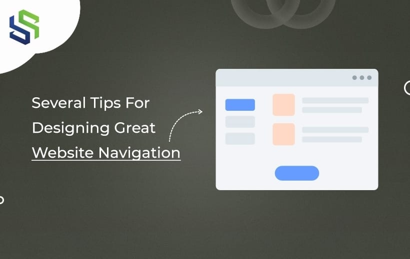
Source: EPIC
Types of Website Navigation
First, every website is different in its design, content, and structure, but a few standard types of website navigation menus can help you recognize all-round in the online world. These normal standards are open to analyzing and helping users find their way around the website.
Navigation menu- HEADER: This ideal menu appears at the top of your website page, normally running horizontally across the screen.
Sidebar menus on the left/right of a site: This is a list, i.e., one located on the side of your page. It’ll depend on choice, i.e., whether it’s minimal or takes center stage and becomes an essential part of the design.
Split-up menu: This new website design trend breaks the website menu by placing links to each page in the corners or sides of the screen.
Hamburger menu: This is often spotted on mobile navigation; this simple three-line icon is now visible on many desktops. The hamburger menu offers a minimal icon that doesn’t interfere with the website’s design and is especially useful when limited to real estate.
Footers: Your website footer is a substantial place to add your social media links and other links that site visitors may find useful. It also repeats the navigation menu at the top of your page.
Tips to Design the Perfect Website Navigation
Think Structure First

Source: EduPointBD
Like other things, let’s start with basic things.
Plot out a sitemap that contains all the information that needs to be mentioned on the site and think about their importance. Think carefully about your genuine and targeted audience. Explore more about what they’re looking for when they visit your site and their logical flow through it. Then, pop your ideas and work out the information that you gather- a card-sorting session is the best way to figure out the possible way to structure your site content.
Be mindful that our brains need to focus more on items at the top or bottom of the list, so always place the important information at the top or bottom of the list.
Keep It Simple

Source: OW
Ok, firstly, who doesn’t love playing with new design trends? As we know, trying new trends can be exciting and knowledgeable. But when it comes to web navigation, it’s best to focus on the tried and true. Don’t complicate your website by fixing the menu bar in any random location. Stick with a traditional horizontal navigation bar across the top or vertically down, and make it consistent throughout the website. Navigation should be a clear, brief roadmap of everything on the website, so your visitors can get solutions and choose other websites. Hence, your navigation does need to be visually clear-cut from the rest of the website’s content, so it’s easy to locate. To ensure it stands out, you can also go with different colours, sizes, and fonts from the main content.
Be Descriptive

Source: Thinking Maps
You’re missing one trick and falling into the trap of using generic labels for their navigation. Using products/services doesn’t tell people what products or services you offer. And what we do definitely doesn’t tell people what we do. But using descriptive, keyword-rich labels in your navigation is a double bonus. Basically, it communicates to your potential customers who you’re and what you offer them as soon as they look at your site. Secondly, it tells Google that you’re focused on a particular industry, which gives your ranking a boost too.
Another no format-based name- Labelling your menu with Photos, Videos, or White papers is equally unhelpful. People are looking for a subject, not a white paper, so make it easy to find.
Use Responsive Navigation Menus

Source: UX MovementIn today’s world, navigation should be reactive. Unfortunately, the navigation bar is too broad to fit across a mobile screen. With screen space at a premium, you don’t want to waste too much time listing your menu options. One of the best solutions for mobile sites is to use a hamburger bar- three short, stacked lines- that opens to a full menu when clicked on or hovered over. This generally accepted format has become so popular that it’s now used on certain desktop sites. There will be one warning, though, i.e., while this can look imposing on a modest site, you could make the browsing experience too complex if you have many options. When it comes to designing mobile menus, make a note that mobile users have different needs from desktop users, and their attention span is probably somewhat shorter. So make your menus more simple and easy to use, and ensure that the “TAP TARGETS” are big enough for larger fingers to use.
Include a Search Function

Source: resellerclubSearch is a precious, important, and valuable feature for web users, as it gives quick answers and a direct route to the information they require. It would be best if you placed your search box in the header or at the top of your sidebar, so it would be easier to find. Importantly- you should make sure that it functions correctly and directly in the right way, account for spelling errors, and offer related products or services. Although, your search bar isn’t only useful for your visitors, and a great source of information for you too. By finding your search metrics, you can learn how to improve your navigation and twist your naming conventions to make things easier to find from the start.
Make It Easy To Get Home

Source: webdesignerdepot
Ultimately, your visitors should be able to tell where they are on your website at all times and be able to navigate back to their starting point. So make sure you don’t force your visitors to hit the “BACK” button to return to your home page. Also, ensure there are links to the home page throughout the website. The preferred way to provide this is by making your logo clickable and placing it in your header, ideally in the top left just beneath the back button, as this is instinctively where your users will look for it.
Make Navigation Work for Your Visitors
Menu navigation is an essential part of web design, and it’s important to create well-thought-out solutions based on your clients’ needs and satisfaction. Without website navigation, visitors would have a lot of work to find pathways to other information and change points on your site. Take enough time to design your navigation to improve the location of your content and speed up visitors’ movement around your website. To summarise the hot tips, here’s a checklist for your next web design-
- Plan your sitemap in-depth at the starting point
- Overarching rule- users should know where they are from, where they have been and where they are going
- Give various navigation options
- Follow web conventions
- Don’t be afraid to keep a hamburger menu display on desktop sites if suitable
- Use simple, user-friendly terms
To design the perfect website navigation, follow these simple and successful tips:
- Keep it simple and intuitive: Ensure that your navigation is easy to understand and use, with clear labels and logical organization.
- Limit the number of menu items: Avoid overwhelming visitors with too many options. Focus on the most important sections and keep the menu concise.
- Use descriptive labels: Instead of generic terms, use specific and meaningful labels that accurately represent the content or functionality of each section.
- Incorporate search functionality: Implement a search bar prominently within the navigation to help users quickly find what they’re looking for.
- Test and iterate: Continuously monitor user behavior and gather feedback to refine your navigation over time, ensuring it meets the needs and preferences of your target audience.
Connect with us, a custom web app development company, for expert guidance in crafting the perfect website navigation. We specialize in web design development and can help you create an intuitive and user-friendly navigation system.


